
“Tropicana reverted in seven weeks, Gap in under one, and the most quoted Pepsi story rests on a document nobody can authenticate. What the verifiable failures share is a mark replaced faster than meaning can be rebuilt.
The pattern is not bad taste
The famous failures are not stories about ugly logos. They are stories about the gap between two clocks: the speed at which a mark can be replaced, and the speed at which meaning can be rebuilt in a customer's mind.
Tropicana had seven weeks to find that out, Gap had less than one, and the most repeated failure story of all, the leak about Pepsi's 2008 identity, still rests on a document that cannot be traced to the company.
Tropicana: seven weeks, then the icon came back
Tropicana launched new packaging for its best-selling North American product on 8 January 2009. The line, Tropicana Pure Premium, was generating more than 700 million dollars a year, and the same agency, Arnell, produced both the packaging and the advertising. The redesign removed the orange with a straw in it, moved the fruit to the cap, and turned the logo vertically and smaller. Complaints arrived within days.
The measurable damage, as the analysis site The Branding Journal records it, was a 20 percent sales drop over the following two months, which the same source quantifies as a 30 million dollar loss. Both figures belong to that analysis rather than to PepsiCo, and the widely quoted 35 million dollar campaign budget could not be verified in the pages reviewed for this record. The company announced the return of the original packaging on 23 February 2009, and a spokesperson, Gina Judge, framed the reversal as customer-led, saying a group of loyal fans loved the straw-in-orange imagery and the icon was brought back because of it.
Seven weeks on an accelerated clock
-
01
January 2009
New packaging ships for a product line with more than 700 million dollars in annual revenue. The orange with a straw disappears, the fruit moves to the cap, and the wordmark shrinks.
-
02
Days later
Complaints reach the company. The most common one is not about beauty. It is about finding the product: shoppers walked past the shelf where they had bought the same juice for years.
-
03
Two months
The Branding Journal records a 20 percent sales decline and quantifies it as a 30 million dollar loss. The figure is the site's, not the company's.
-
04
23 February 2009
The original packaging returns. The icon that had been removed is reinstated, and the company describes the decision as customer-led.
Gap: six days and a wordmark nobody asked for
Gap's 2010 logo lasted less than a week. The blue box and capitalised serif wordmark, in place for about 20 years, was replaced by a Helvetica wordmark with a small blue square overlapping the letter P. The change was never implemented in the United Kingdom. Gap's North American president, Marka Hansen, defended it at launch as more contemporary, describing it as honouring the heritage through the blue box while taking it forward. The company then invited customers to submit designs of their own, and reverted.
The BBC's account of that week is the useful part for anyone running a brand today. Craig Smith, a marketing specialist quoted in it, described the mechanism: a company believes it has found an opportunity to evolve and thinks it can shortcut the process by changing the visual identity and carrying customers along. Gap did not test the shortcut before taking it, and the market answered within days.
Four numbers that are actually on the record
20percent
Sales decline in the two months after Tropicana's packaging launch
The Branding Journal's figure, which the site quantifies as a 30 million dollar loss.
6days, or fewer
How long Gap's 2010 logo survived
It was never implemented in the United Kingdom. BBC News Magazine, October 2010.
88years
The age of RadioShack when it launched the campaign asking customers to call it The Shack
NPR reported the campaign on 5 August 2009, which is six years earlier than the date most listicles print.
55years
The life of the Weight Watchers name before it became WW
Announced 24 September 2018. The chief executive could not say what the letters stand for.
Four stories that do not survive the record
The Pepsi 2008 strategy document
The 2008 Pepsi presentation circulates on mirrors and its authorship is unverified. It is quoted in almost every listicle about that identity without a traceable source inside the company.
Use it, if at all, as an example of how a document becomes folklore, never as Pepsi's own reasoning.
RadioShack rebranded in 2013
NPR reported the campaign on 5 August 2009 and described the retailer as 88 years old at the time. The 2013 date belongs to later management decisions, not to the name change.
A wrong date is more than a slip: it changes the argument, because the campaign becomes part of a company's last decade rather than its middle age.
The 200 million dollar RadioShack spend
That figure did not appear in any page reviewed for this record. It circulates as a footnote to the campaign, and unverified spends make failures look more expensive than the evidence supports.
The 35 million dollar Tropicana campaign budget
Also untraceable in the sources read. The Branding Journal puts the total cost of the exercise at more than 50 million dollars, and that is the site's own estimate, not a company disclosure.
RadioShack: a name change that was only a campaign
In August 2009 RadioShack announced a branding campaign whose instruction was to call the company The Shack. The reporting language matters: the retailer wanted to be referred to that way, which is not the same as renaming the corporation, the stores or the legal entity. Customers kept saying RadioShack, and the business continued to be described that way.
The distinction is the lesson. A campaign asks for a nickname; a rename asks customers to rebuild everything they stored under the old name. Only one of those is cheap to reverse, and the cheap one was the one that got reversed.
WW: when nobody can define the new name
Weight Watchers announced the change to WW on 24 September 2018, after 55 years under its original name. The chief executive, Mindy Grossman, was unable to say what the letters stand for, describing WW as simply a marque, and the company presented the change as a shift from weight loss to health and wellness.
The market context was strong at the time: Oprah Winfrey had bought a 10 percent stake in 2015 and acted as an ambassador, the share price had risen from under 5 dollars to about 70, and second-quarter 2018 sales rose around 18 percent with subscribers up about a million year on year to 4.5 million. The company had also faced a backlash that year over free teen membership and the hashtag that followed it. None of that makes the name change a failure; it makes it a case where the letters could not carry the meaning the business was claiming.
Five cases, the documented duration and the outcome
| Change | Year | How long it stood | Documented outcome |
|---|---|---|---|
| Tropicana Pure Premium packaging | 2009 | About seven weeks | 20 percent sales decline over two months, quantified by the analyst as 30 million dollars; original packaging restored on 23 February |
| Gap logo | 2010 | Less than a week | Never implemented in the United Kingdom; customers were invited to submit designs before the company reverted |
| RadioShack campaign name | 2009 | Campaign, not a rename | A request to be called The Shack; the corporate and store names did not change |
| Weight Watchers to WW | 2018 | Still in use | Announced after 55 years; the chief executive could not define the letters |
| Twitter to X | 2023 | Still in use | Brand Finance's estimate fell from 5.7 billion dollars in January 2022 to 673.3 million in 2024 |
X: the case where the measurement is contested
Elon Musk and the chief executive, Linda Yaccarino, announced the rebrand on 23 July 2023, and the white X on black replaced the blue bird on the desktop version the next day. Tweets were to become x's. The founder's own framing is on the record.
And soon we shall bid adieu to the Twitter brand and, gradually, all the birds.
Brand Finance's model recorded 5.7 billion dollars in January 2022, nearly 3.9 billion in 2023 and 673.3 million in 2024, with the Brand Strength Index down 12.7 points to 56.9 out of 100 and the brand dropping out of the firm's rankings that year. The same release attributes the decline to the advertising market as well as to branding, citing roughly 600 million dollars per quarter in 2023 against more than a billion dollars per quarter in 2022, with advertising making up about three quarters of revenue. The honest reading is that a rebrand, a business cycle and a reputational crisis happened in the same two years and no one can separate them cleanly.
Four questions to ask before replacing a mark
Which asset are people actually using to find us?
Tropicana's customers deplored the loss of an orange with a straw, not a typeface. Inventory the recognition assets before deciding which one is expendable.
Recognition, not preference
What can we measure in the first eight weeks?
Units, reorder rates, search volume for the old name, inbound calls asking whether the product still exists. A redesign with no reading instrument is an opinion with a budget.
Two months is one reporting cycle
Who decides to reverse, and how fast?
Gap reverted in less than a week; Tropicana needed seven. Both decisions required a named owner with the authority to stop a launch mid-flight, and that authority is easier to agree before the launch than during it.
Pre-agreed reversal path
Is this a rename or a nickname?
RadioShack asked to be called The Shack without changing its corporate name, which is why the request could be quietly dropped. Decide which one you are doing, and say so in the brief.
Scope of the ask
What recognition looks like in the wild
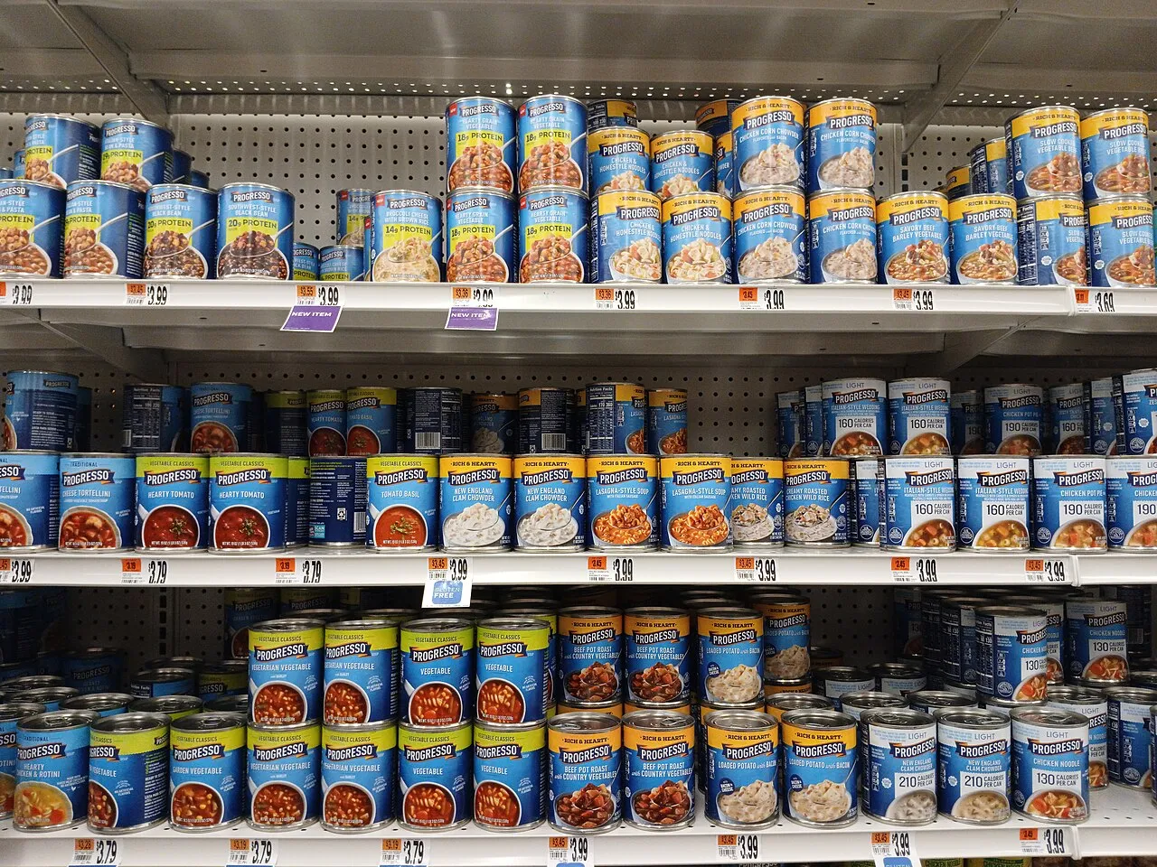
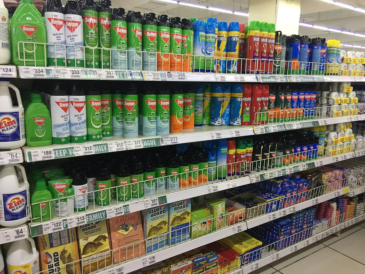
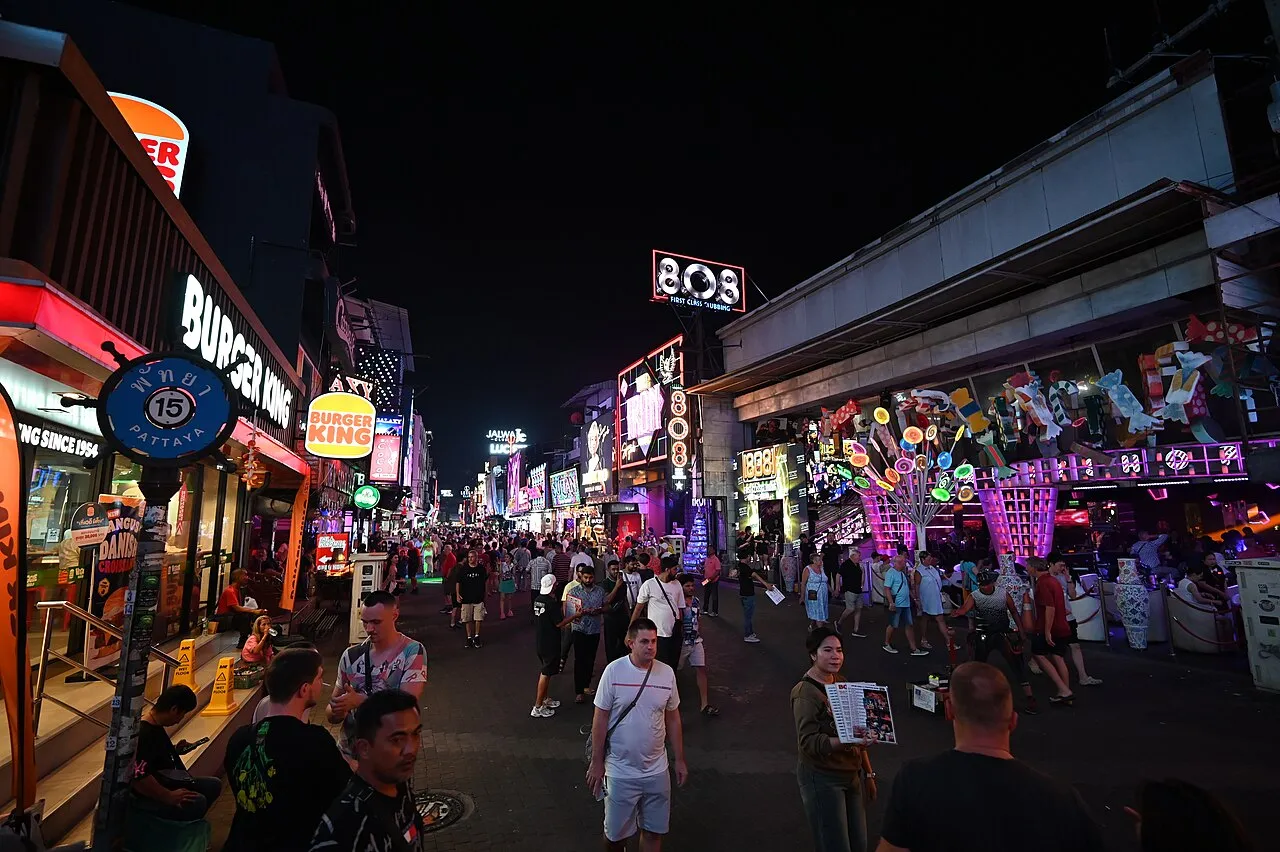
Packaging failures are decided on shelves, in seconds, by people who are not looking at the design. The images below are ordinary retail environments: the place where a changed mark either survives or becomes a mystery.
What to do with this
- Treat recognition as the asset under management.Customers searching for a product look for the icon they remember, and an icon removed without a replacement cue is a lost sale before it is a design argument.
- Put a clock on the change.Two months is one reporting cycle, and a reversal path agreed before launch costs nothing when it is not needed.
- Separate the campaign from the rename.RadioShack asked for a nickname in 2009 and kept its legal and store names; knowing which one you are doing decides how expensive a retreat will be.
- Do not let unverifiable numbers carry your argument.The 200 million dollar RadioShack spend and the 35 million dollar Tropicana budget could not be traced; the figures that are on the record already make the case.
- Quote the range when the record disagrees with itself.On the X valuation, Brand Finance's own release ties the fall to advertising revenue and reputation as well as to the name.
- Test the ugly question first.Ask whether the identity will still be found from four metres, in bad light, by someone who is late for a train.
Sources
- What to learn from Tropicana's packaging redesign failure — The Branding Journal, 2015 (figures are the site's own analysis)
- Gap logo reversal and the Tropicana spokesperson's account — BBC News Magazine, 12 October 2010
- RadioShack changing name to The Shack — NPR, 5 August 2009
- Weight Watchers becomes WW — BBC News, 24 September 2018
- The decline of X: rebrand wipes billions in brand value — Brand Finance, 12 September 2024 (valuation model estimate)
- Twitter to X rebrand and Musk's statement — BBC News, 24 July 2023