
“Mastercard waited three years after its 2016 redesign before dropping its name, and it had a figure first: 81 percent of consumers recognised the new symbol alone. Burberry's churn and Instagram's memory test make the same point.
The asset that has to survive the change
The strongest rebrands keep one asset the audience already recognises and modernise everything around it, and they can show the numbers they used to decide.
Mastercard, Burberry, Instagram, Mailchimp and Dropbox give five documented answers, from 2.3 billion cards carrying an old mark to a five-second drawing test.
The record is more useful than the taste argument
Rebranding has a poor reputation because most public arguments about it are about taste. The documented cases are more useful than the arguments. The transitions below keep a recognition asset and change the system around it, and each one left a number, a date or a research method that a committee can actually argue with.
Mastercard's 2016 identity, by Pentagram partners Michael Bierut and Luke Hayman, was the brand's first change in 20 years. It replaced the stripes in the overlap with a solid orange, moved the wordmark outside the symbol and set it in lowercase. The colour shift was technical rather than decorative: the new mark uses an additive colour mix so the overlap reads brighter on screens, where the original subtractive mix darkened.
At the time, 2.3 billion Mastercard cards were in circulation carrying the previous mark. That figure is the scale problem in one line, and it is also the reason the wordmark did not disappear in the same project. The famous removal came three years later, once the brand could prove what the new symbol was doing on its own.
Three ways a change keeps its recognition
The cases below are not three styles. They are three mechanics, and each one answers a different question a board will ask before approving the work.
Mastercard: the wordmark left in a second project
Pentagram reports that 81 per cent of consumers spontaneously recognised the new symbol without the name. At CES on 10 January 2019 Mastercard announced the wordmark would be dropped entirely, citing its own research that more than three-quarters of consumers could identify the brand from the circles alone. Nothing about that decision was aesthetic. The removal was taken when the measurement said the symbol could carry the brand by itself, which is why it happened three years after the redesign rather than inside it.
Instagram: employees drew the old icon from memory
Instagram's May 2016 redesign, led by design director Ian Spalter, replaced the retro camera icon with a gradient-backed outline and flattened the interface around it: white and grey replacing blue, pink notifications, outline toolbar icons, and the same treatment extended to the Layout, Boomerang and Hyperlapse icons. The team tested recognition directly before deciding what to keep. Employees were asked to draw the icon from memory in five seconds, and almost all of them drew the rainbow, the lens and the viewfinder, so those three elements were carried into the new icon.
Mailchimp: the system stayed, everything visible moved
Mailchimp's September 2018 refresh, by Collins, kept the brand recognition system and changed its expression. Cavendish Yellow became the main colour, Cooper Light became the typographic system, the capital C was dropped, a chunky sans-serif wordmark replaced the 2013 hand-drawn one and Freddie was redrawn. The work also had a commercial shape: 35 solutions were consolidated into five portfolio categories, which is a rebrand doing an organisational job rather than a decorative one.
Sequence is the whole argument
The two Mastercard moves were three years apart, and that gap is the most transferable thing in this article. At CES on 10 January 2019 the company announced the wordmark would be dropped entirely, citing its own research that more than three-quarters of consumers could identify the brand from the circles alone. The symbol had already been in market since 2016, measured and reported, when the name came off.
Burberry is the counter-example, and its designer said so himself. The August 2018 identity, by Peter Saville with chief creative officer Riccardo Tisci, replaced a logotype used since 1901 and the Equestrian Knight device with a new sans-serif logotype and a monogram, announced through the brand's Instagram. Daniel Lee, chief creative officer from 2022, reintroduced the archive Equestrian Knight logotype in February 2023. Saville's 2025 assessment was that the churn itself was the mistake, and that at any point over the last two years you could have found at least three different Burberrys circulating in the world.
The difference between the two stories is not talent. One team treated the change as a sequence of measured steps; the other treated it as a series of statements, and the asset the audience had learned was replaced before anything had been proved about its replacement.
What the people who made the calls said
Scroll or swipe the quotes
Reinvention in the digital age calls for modern simplification… with more than 80 percent of people spontaneously recognising the Mastercard symbol without the word 'Mastercard' we felt ready to take this next step in our brand evolution.
Raja Rajamannar, chief marketing officer, Mastercard, in Dezeen, 2019
So at any point over the last two years, you could have found at least three different Burberry's circulating in the world… This is totally and utterly irresponsible.
Peter Saville, designer, in Dezeen, 2025
We decided to translate these elements into a more modern app icon that strikes a balance between recognition and versatility.
Ian Spalter, design director, Instagram, in Dezeen, 2016
The research that belongs before the mark
Research before the mark is what separates a rebrand from a redesign. Airbnb's Bélo, launched in July 2014 and designed by DesignStudio, followed roughly a year of work that included one intensive week in which four team members travelled to 13 cities, stayed with 18 hosts across four continents and interviewed more than 120 people. The stated goal was a marque anyone could draw, which is a recognition target stated before the drawings existed.
Instagram's team ran the cheapest version of the same test in an office. Employees were asked to draw the icon from memory in five seconds, and almost everyone drew the rainbow, the lens and the viewfinder, so those elements were carried into the new icon and the interface was flattened around them. The test cost almost nothing and answered the only question that mattered: what is the brand when the person cannot look it up.
Mastercard's numbers arrived after launch rather than before it, which is the other legitimate order. Pentagram records 81 per cent spontaneous recognition of the new symbol without the name, and the 2019 wordmark decision rested on the company's own finding that more than three-quarters of consumers could identify the brand from the circles alone. A committee that skips this stage is choosing to find out in public.
Six transitions, with the evidence each one left
Dates matter in this subject, because half the myths about rebranding come from compressing two decisions into one. The table records what changed, what was kept and what the record actually shows.
| Case and year | What changed | What was kept | Evidence in the record |
|---|---|---|---|
| Mastercard, 2016 | Overlap stripes became solid orange; the wordmark moved outside the symbol and was set lowercase | The two circles | 2.3 billion cards carried the previous mark at launch; Pentagram |
| Mastercard, 2019 | The wordmark was dropped entirely at CES on 10 January 2019 | The symbol, already measured in market | Company research found more than three-quarters of consumers identified the brand from the circles alone; Dezeen |
| Burberry, 2018 | A logotype used since 1901 and the Equestrian Knight replaced by a sans-serif logotype and a monogram | Little at the time; the knight returned in 2023 | Saville's own account of three identities circulating in about two years; Dezeen |
| Instagram, 2016 | Retro camera icon replaced by a gradient outline; the interface flattened around it | The lens, the viewfinder and the rainbow | Five-second memory drawings by employees; Dezeen |
| Mailchimp, 2018 | Cavendish Yellow, Cooper Light, the capital C dropped, Freddie redrawn | The brand recognition system | 35 solutions consolidated into five portfolio categories; Collins and Creative Review |
| Dropbox, 2017 | The system rebuilt around syncing teams, with Sharp Grotesk, an isometric diamond and a Flex Deck layout logic | The name and the service | Collins case study, which is the agency's own account of its work |
Read the first two rows together and the most quoted misunderstanding in this field disappears: the 2016 redesign and the 2019 removal were separate decisions, made three years apart, with a measurement in between.
What a system change does when it is not a logo change
Dropbox's 2017 system, built by Collins with the in-house Dropbox Brand Studio and specialist studios, is the clearest case of a change that was never really about a mark. Collins describes the rebuilt brand as organised around syncing teams rather than syncing files, with Sharp Grotesk typography, an isometric diamond and a Flex Deck layout logic. That sentence is the agency's own account of its work, which is exactly how a case study should be read.
The same distinction appears at a smaller scale in Mailchimp's September 2018 refresh, also by Collins. The recognition system stayed, the expression changed, and the commercial story underneath was consolidation: 35 solutions reduced to five portfolio categories. Neither project needed a different name to become a different brand, and neither asked the audience to relearn what the company was for.
A committee can use this as a test. If the proposed change alters what the company is for, it is a positioning project wearing a design costume, and it needs the research and the sequencing that a positioning project needs. If it alters how the company looks while the promise stays put, it is a refresh, and it should be priced and scheduled as one.
Where a changed identity meets a customer
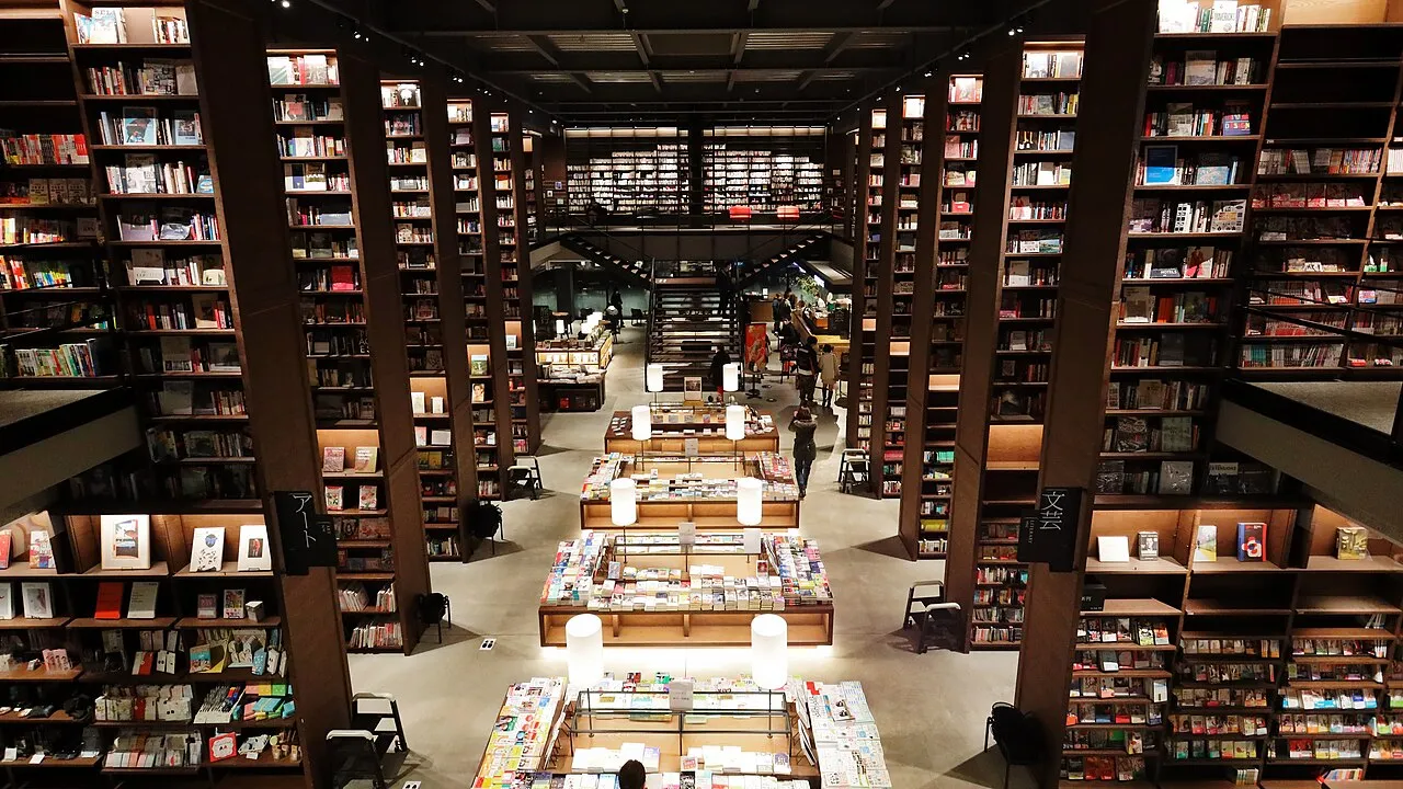
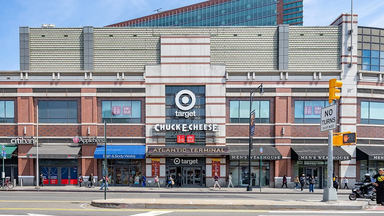
A rebrand is argued about in decks and decided at this distance: on a shelf, in a concourse, at a rack. The three photographs below are not illustrations of the cases above. They are the conditions a new identity has to survive before any case study about it is worth reading.

When reversal is the right decision
Burberry's reversal deserves better than being filed as a failure. The archive Equestrian Knight logotype came back in February 2023 because it still carried recognition that a monogram could not buy, and Daniel Lee was hired to change the company's direction. The expensive part was not the 2018 identity; it was the churn around it.
A rollout plan is where recognition is actually kept or lost. Mastercard's case shows the constraint in one figure: 2.3 billion cards carried the previous mark when the 2016 identity launched, and the wordmark came off three years later. No launch calendar can flip an asset that lives in that many wallets at once, which is why phasing is the professional answer to impatience.
There is also a cheaper option that committees forget: change less, test more. Instagram kept three elements that memory testing surfaced and rebuilt everything else around them, at a cost far below the price of relearning. The audience never had to decide whether the brand was still itself.
Three cautions before the next rebrand deck
What to do with this on Monday
- Name the recognition asset that survives before anyone touches a mark.Instagram kept the lens, viewfinder and rainbow after five-second memory drawings; Mailchimp kept its recognition system and changed its expression.
- Put a measurement between the redesign and the removal.Mastercard dropped its wordmark at CES on 10 January 2019, three years after the 2016 identity, citing more than three-quarters of consumers identifying the brand from the circles alone.
- Pay for the research before the launch, not after it.Airbnb's Bélo took about a year and included 13 cities, 18 hosts, four continents and more than 120 interviews.
- Read agency case studies as claims.Collins' Dropbox account is the agency's own narrative, and its causal attributions are not findings.
- Phase the rollout, because recognition lives in the installed base.2.3 billion Mastercard cards carried the previous mark when the 2016 identity launched, which is why the name came off in a later project.
- Do not let a reversal become churn.Burberry's 1901 logotype and the Equestrian Knight were replaced in 2018, the knight returned in February 2023, and the designer called the intervening churn irresponsible.
Sources
- Mastercard — Pentagram, accessed 2026
- Mastercard drops its name in branding overhaul — Dezeen, 10 January 2019
- Burberry logo redesign was 'irresponsible', says Peter Saville — Dezeen, 13 June 2025
- Instagram scraps retro logo for more modern design — Dezeen, 11 May 2016
- The truth behind the controversial Airbnb rebrand — Creative Bloq, accessed 2026
- Mailchimp — Collins, accessed 2026 (company claim)
- Dropbox — Collins, accessed 2026 (company claim)