
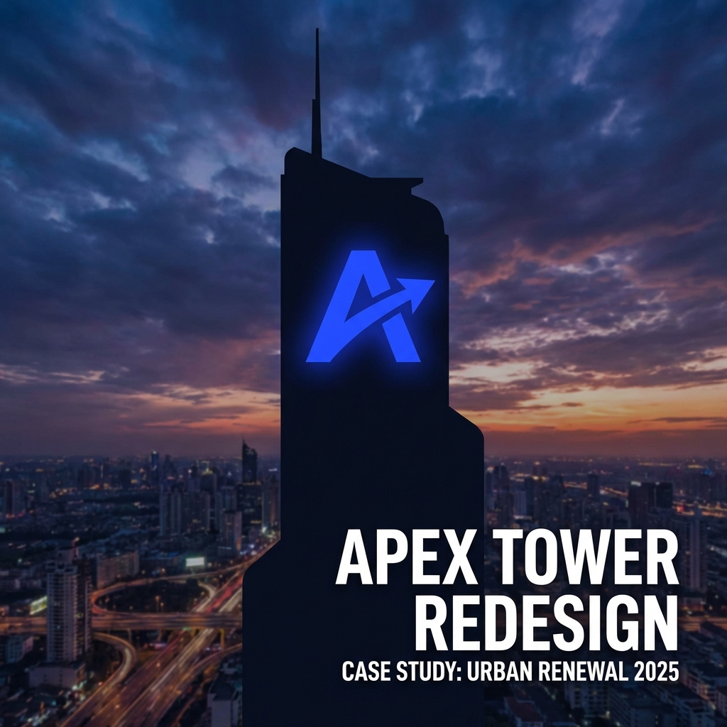
“A property lookbook should distinguish actual photographs, architectural visualisations and reference imagery clearly. These assets answer different questions and carry different implications. Good art direction can create a coherent atmosphere while preserving the reader’s ability to understand what is real, proposed or illustrative.
A property lookbook should distinguish actual photographs, architectural visualisations and reference imagery clearly. These assets answer different questions and carry different implications. Good art direction can create a coherent atmosphere while preserving the reader’s ability to understand what is real, proposed or illustrative.
Classify every asset before layout
Create an asset register with source, permission, project relevance and status. Confirm the approved description with the property team. Do not assume that a supplied image is actual project photography simply because it arrives in the same folder as plans and official identity files.
Make an image selection sheet that explains the purpose of each picture.
Write labels that clarify status
Use concise labels near the relevant image and maintain them across formats. A general note at the end may not explain a standalone image forwarded later. Build the sequence around distinct communication roles so the lookbook offers explanation rather than a collection of attractive but ambiguous scenes.
A hypothetical working example
Hypothetical example: a launch lookbook includes a construction-site photo, an interior visualisation and a material reference. Each is labelled by role. The material page explains the design direction without presenting the reference interior as a completed room inside the project.
Build a coherent image sequence
Checklist: verify asset status, permission, caption accuracy, proposed features and standalone exports. Check every version shared with brokers. When an image changes during design development, replace or retire the linked exports rather than updating only the original presentation file.
Maintain an evidence sheet alongside the creative brief.
Keep inspiration from becoming a promise
Visible labels can interrupt a perfectly minimal composition and improve understanding. Removing them may preserve atmosphere while increasing ambiguity. Integrate readable captions into the design system, choosing calm placement and clear wording rather than treating necessary clarification as an aesthetic failure.
Review images when forwarded alone
Ask readers to classify several pages without additional explanation. If they mistake references for project evidence, strengthen labels or separate the section. The lookbook should remain useful for a person who has not attended the design presentation and does not know the image production history.
Review the strongest hero image especially carefully. Its prominence can make readers infer a promise even when a small caption says otherwise. Compare the visible scene with the approved project information, then adjust the image choice, wording or layout so the combined message remains accurate.
To translate these decisions into a coherent working system, explore Gameel property marketing and campaign design services. Share the audience brief, available evidence and intended deliverables so the scope reflects the actual problem.