
“A payment calculator converts when the first input is easy, the range is honest, the moving parts are explained and the result leads to a person, not a dead end. Regulators write the same requirements from the other side.
The first input decides the outcome
A payment calculator is usually the most visited tool on a property or finance site and the least resourced. It earns its keep with one field, an honest range and an exit into a conversation.
Every extra number requested before the first result is a tax that falls hardest on the people most likely to buy.
Cost visibility is the whole problem
The annual abandonment research published by the Baymard Institute stays remarkably consistent, and its 2025 list of reasons shoppers abandon a checkout reads like a brief for any cost-bearing page. Extra costs revealed too late account for 40 percent of abandonments; 19 percent distrust the site with card information; 17 percent find the checkout long or complicated; and 12 percent could not see or compute the total order cost up front.
A mortgage or payment calculator faces the same psychology from the front door. The visitor arrives with one question — what will this cost me — and every hidden fee, invented estimate or single-number answer is the calculator equivalent of the surprise shipping fee. The pattern that works in checkout, showing the total early and itemising what can move, is the same pattern that works before an application is ever started.
That is why the subject matters to a design agency doing property or fintech work. The calculator is not a widget; it is the business's first statement about what its people will do with your data and your time.
Two calculators, only one of them qualifies
Qualifies
- The first field is the property price; the deposit sits behind it as an optional refinement.
- The result is a range with the assumptions printed beside it.
- It marks which costs are fixed in law and which ones move.
- It ends with a named person who can continue the conversation.
Traps
- Five fields of personal data appear before the first number does.
- One reassuring monthly figure with no range and no assumptions.
- Pre-checked add-ons for insurance the visitor never asked about.
- It ends in a capture form with no human contact in sight.
Disclosure rules draw the edges of the pattern
The useful design constraint is that disclosure law already encodes much of this. In the United States, the integrated disclosure rules define the prescribed forms and their timing: Regulation Z's sections 1026.37 and 1026.38 set the Loan Estimate and the Closing Disclosure, and the consumer bureau's explainer states plainly that lenders are required to provide the Closing Disclosure three business days before the scheduled closing. Those forms are not optional; the calculator is an ambassador for how the real forms will feel.
Across the Atlantic, the UK financial regulator's mortgage conduct sourcebook requires a mortgage illustration before the customer submits an application, and — where advice was given by telephone — within five business days. Its stated intent is that the customer should not be committed before having the opportunity to consider the illustration. In other words, the consumer is owed a guided, itemised view of the money before they can be locked in, which is also a usable product requirement.
A calculator cannot opt out of either rule. It succeeds when its vocabulary, item structure and tone act as training wheels for the regulated experience that comes next, built on the same fixed-versus-moving cost distinction the real forms enforce.
The honest calculator, step by step
-
01
One field before any result
Price or budget is the single input that unblocks the first answer. Deposit, term and rate arrive as refinements with visible defaults, not as gates.
-
02
Show a range, print the assumptions
A point estimate invents certainty. A range with printed assumptions teaches the visitor what moves: rate bands, term changes, tax updates.
-
03
Compare with the regulator's metrics
Where the market expects them, surface the official comparison figures in the same breath as the monthly number, so comparison shopping starts inside the tool.
-
04
Explain what may move
The consumer bureau documents when costs may change and requires significant changes to be explained. The calculator can pre-explain them before an application exists.
-
05
End in a person
The result footer offers a callback with a name, a stated area of expertise and a time slot. A dead-end form loses the qualified lead it was built to find.
Financing is now a screen-first conversation
The audience has already moved. In its 2024 consumer housing trends report, Zillow says 62 percent of buyers used a real estate website or app when looking at financing options, up from 33 percent in 2019. Whatever one thinks of portals, financing advice now begins in the same glass rectangle where the listings live, which is exactly why the calculator's tone is onboarding for the whole relationship.
The same popularity is why regulators started writing about interface design directly. The Federal Trade Commission's 2022 report on dark patterns documents interfaces engineered to obscure costs or to convert reluctance into clicks. The European Union's Digital Services Act then made the standard explicit for platforms: interfaces shall not be designed in ways that deceive or manipulate people or materially distort their free and informed decisions.
Read the sequence in order and the message is unambiguous. What used to be an ethics seminar about aggressive marketing became a specific, enforceable design standard. Pre-checked add-ons on a payment calculator are not edge-case creativity; they are the exact conduct those documents name.
The regulated boundary
Providers of online platforms shall not design, organise or operate their online interfaces in a way that deceives or manipulates the recipients of their service.
Three claims that do not survive compliance
An online calculator satisfies disclosure duties
The integrated disclosure rules require the prescribed Loan Estimate and Closing Disclosure forms at defined times; a web calculator is a teaching aid about them, not a substitute. The interface is the interface; the obligation lives on the forms and their timing.
Final costs may move freely after the estimate
The consumer bureau documents when costs may change and requires significant changes to be explained. Movement is governed, not free, and the calculator that hides the moving parts misrepresents how the system works.
Pre-checked add-ons are just aggressive marketing
The FTC's dark-patterns report and Article 25 of the Digital Services Act treat deceptive interface design as actionable deception, not as a marketing style. The boundary is not taste; it is law.
Pattern by pattern
| Pattern | Why it works | The failure mode |
|---|---|---|
| Single first field | Removes the cost of the first result | Hidden defaults later substitute assumptions nobody chose |
| Range with printed assumptions | Sells exactly the certainty the model has | Ranges widen until they carry no information |
| Official comparison metrics inline | Aligns the tool with the regulated vocabulary | Metrics are pasted over a slider-dominated page and go unread |
| Moving-costs explainer | Pre-answers the suspense of the real forms | Legal review hardens the copy into citations nobody reads |
| Callback with a name and a slot | Converts a calculated number into a relationship | The callback queue starves the quality it was designed to filter |
| No pre-checked extras | Keeps the page outside regulated deception territory | Revenue arguments install them quietly after launch |
What the inputs already tell you about the lead
The quiet business case for an honest calculator is lead quality. A visitor who enters a property price, adjusts the deposit and works the range has already self-reported a budget band and a degree of seriousness; the visitor who abandons a five-field form self-reported nothing, and took the goodwill with them. Qualification is what a well-built calculator does as a by-product of being useful, not through a disguised form.
That reframes the brief. A calculator's graduation is not the size of its audience; it is how many of the inputs a sales team would trust on a Monday morning. The design goal is to capture the visitor's honest state — the price they are considering, the deposit they can imagine, the timing they have in mind — and to make that state visible, printable and handable to the next human step.
Persist the state of the session and you already have almost everything the follow-up needs: the fields that were asked, the values that were chosen, and when the calculation ran. Anything less asks the visitor to relive the interview twice.
Where the money conversation lives
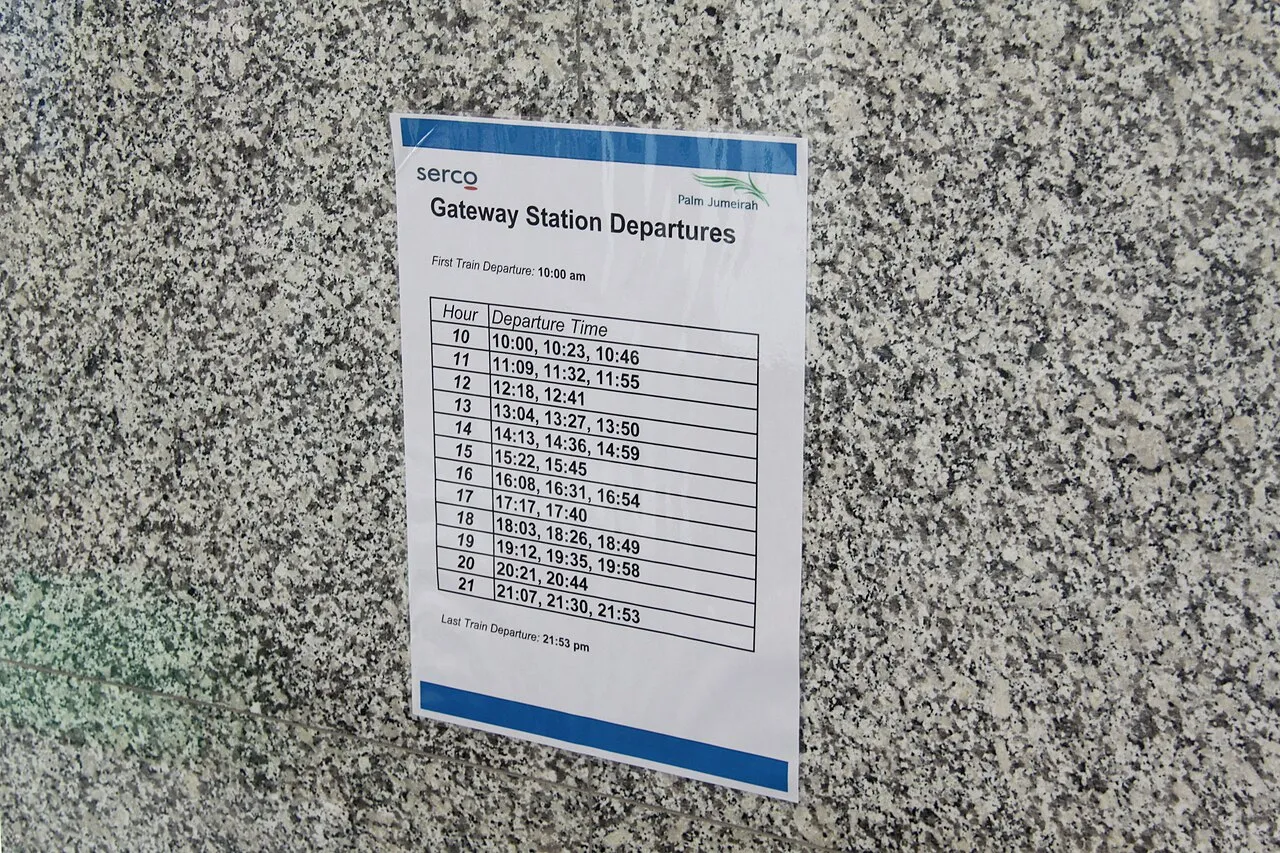
Payment conversations have always mixed a screen with a piece of paper: the schedule across from the notebook, the workspace with the tablet, the figure in one margin against the assumption in the other. The photographs below belong to that terrain — a bare workspace with a tablet ready for the first input, a printed schedule from the era when intervals came on paper, and the notes a person takes when the range they were given is not quite enough.


What to do with this
- Ask nothing before the first result.Baymard's abandonment list puts invisible totals first, and a calculator can give an honest range for exactly one field.
- Print the assumptions where the result is.A range without its assumptions is decoration, and decoration collapses at the first regulator question.
- Treat disclosure law as a product requirement.Three business days before the closing forms; five business days for the UK illustration. The regulator has already drawn part of the interface.
- Explain what moves before anyone signs.The bureau requires significant changes to be explained, and the calculator can pre-explain them as onboarding.
- Let the tool end in a person.The result page should offer a named callback, because the visitor who deserved a range also deserves a handover.
- Design the pre-checked box empty, and keep it empty.Dark-pattern conduct is documented and, at least in Europe, actionable; the default state is a design decision with legal consequences.
Sources
- Closing Disclosure explainer — Consumer Financial Protection Bureau (modified Oct 2023)
- TILA/RESPA integrated disclosures compliance resources (Reg Z 1026.37/38, timing) — Consumer Financial Protection Bureau
- MCOB 5.5, the mortgage illustration and its timing — FCA Handbook
- Buyers housing trends report 2024 (financing options research) — Zillow Research
- Cart abandonment rate statistics 2025 — Baymard Institute
- Regulation (EU) 2022/2065 Digital Services Act, Article 25