
“Luxury presentation is not a reason to hide facts; hierarchy lets atmosphere introduce the place while evidence answers the next decision.
Diagnosis
A premium brochure often treats every spread as a reveal. The reader gets mood, material, and oversized type but must hunt for location, status, unit logic, access, or limitations. A beautiful sequence can therefore feel evasive. The design problem is not too little information; it is no deliberate order for different reading speeds.
Decision framework
Set three layers: orientation and proposition, decision facts, then depth and proof. A reader should find the project, audience, status, key distinction, plan, unit or service logic, delivery boundaries, and contact route before optional atmosphere. Use headings, captions, map keys, and repeated status language to make navigation visible.
Hypothetical property example
Implementation and measurement
Create a page-by-page hierarchy map before art direction. Label each spread by reader question and evidence owner. Test print and mobile PDF versions with a timed find task: location, status, contact, and one limitation. Measure findability and misread status, then refine sequence without adding decorative copy. Hierarchy also protects the atmosphere: when readers can find the facts, the visual pauses feel intentional rather than like attempts to delay an uncomfortable answer. Elegance is therefore expressed through control, spacing, and sequence—not through withholding the information needed to decide.
Put it to work
- Design the fact sequence before choosing the photography sequence.
- Repeat status language at the point of decision.
- Test printed and mobile versions with find tasks.
Sources and visual credits
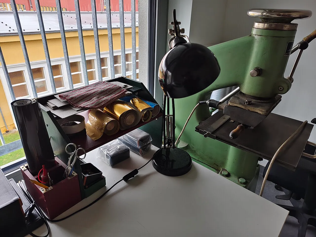
Illustrative photograph: Knihovna Petriny Kniharsky Razici Lis B. It does not depict the hypothetical example. Mojmir Churavy · CC0 · Wikimedia Commons